
Jess Ruliffson on "Art Budgeting" with Alison Bechdel's Fun Home
Jess Ruliffson is a lead instructor at SAW. Her webpage is https://jessruliffson.com
Hi Everyone! Hope your week is going swell! I wanted to share some cool things I noticed the last time I read Fun Home by Alison Bechdel. If you haven't read it, it's worth a peek, especially if you are thinking about structure for nonfiction or memoir. I won't get too much into the structure of her book, but let's look at different choices she made on approaching how to ink and draw her story.
One thing I seem to be thinking about a lot lately is how to make an "art budget" for a long form comic. Or even a short comic! In the SAW weekly meetings, sometimes we do short exercises. In these instances, we have just a few minutes to accomplish a rough of an idea (color three panels of a comic, etc) and in that short time decisions are made about how much detail to include, where to really "spend" your budget.

In the page above, Bechdel keeps the sky black in two out of three panels. She could have gotten lost drawing waaaaay more buildings but she resisted. But, she likes the light blue wash and put it in one of the panels' skies. I have to speculate this is because alternating the skies from black to wash is more interesting, and that each panel has its own emotional "beat", if you will.
This seems especially apparent in the third panel when father and daughter are standing silently together as Bechdel realizes there are openly gay people at the party--at fifteen this is an emotionally significant moment for the author. So that black sky adds contrast, drama, maybe even silence. It's a great choice! And also, if you black out a few things on a comic page, it's less detail you have to worry about drawing. Here, Bechdel is really spending her budget wisely and having fun.
(Here's the next page in that scene where you can see more of that drama unfold.)

The panels throughout the book feel like snapshots of memories--and some of the details are rendered almost tenderly, like the second tier of panels.
Having that second panel just be a caption box gives an emphasized voiceover-from-the-future-self looking back into memory. Drawing the back of her own head in the top panel invites us to stand with her (and yay drawing the back of a head might even be less work that trying to figure out the exact right facial expression in this particular moment, wise choice! And it works better.) Love the solid black of the bottom panel paired with the gentle wash she is so great at. Even though the scene has changed, making that background black helps the ideas "live" in the same place ("it was quite a gay weekend all around.") We don't exactly know the scene has explicitly changed to the ballet until the next page, but the images are similar (examining the male form through a queer lens.)
This is the final page in that three page sequence.

I LOVE how Bechdel silhouettes the crowd at the ballet EXCEPT for the teeny stage performers and her and her family at the bottom right. She gets to do the wash she so loves, and the balance of black and white here makes the wash look awesome. She could have drawn all the faces in the crowd, but she's spending her art budget in the interest of 1) saving time 2) Emphasizing what matters. GREAT!
The wash is ever so slightly darker in the theater panel compared to the top tier (top two panels) because it's a different moment. She could have made the theater more literally dark, but she didn't need to.
This is later in the book, and I LOVE how she spends her art budget on this page, it's clever and strange.

There are a LOT of books that she goes to the trouble to draw, but not exactly every page of each book (in panel two I would have been tempted to draw lots of lines on the book pages but she just adds a wash and calls it a day.) But WAIT, add some cool lines to the jacket--so stylish! And it differentiates two same-value moments as different objects. NICE)
But the best part of this page is the tiny butt on the cover of The Odyssey and the little silhouettes of the library patrons in the right corners of panel two and three (curly hair and eyeglasses for fun or showing off!) Bechdel employs that caption-only panel dance move again so there's space for the images to breathe, and for time for the reader to contemplate the language of the story--Bechdel draws two shots of the library here so it's good she didn't have to draw it three times. But she's added variety where the character is close up and then far away--but I love the idea of an object in the foreground and her looking at it. Fun page!
Here's a page from the beginning of the book.

She knew she was gonna make this all about her and her Dad BUT it is really all about the RUG (a la Big Lebowski, it really ties the room together) Dad's got a black shirt on (and it's worth noting I think this the only time he really wears black in the book so this was done intentionally to not have Dad and Alison melt into the carpet.) Adding black there and then giving herself a wash stripe on her shirt creates depth and space but is just more fun to ink, because each moment is different.) This is also before the reader really gets a good look at the house, so it's a hint that this house is not exactly like other houses.

The "My-O-My" bar sign and this AMAZING car on the left hand page is a major budget overspend!
But look at the other panels--we've got black backgrounds and some gentle washes in place of background detail.
But wow look at the theater screen in panel two at the right with the credits done in white on black! I feel these pages are full of heavy spending moments.
I usually do this when I find the story itself is kinda in a lull for emotional moments--I just nerd out on the details I want to enjoy inking. I dunno what Bechdel is thinking here, but she wanted to draw that car and draw it she did!
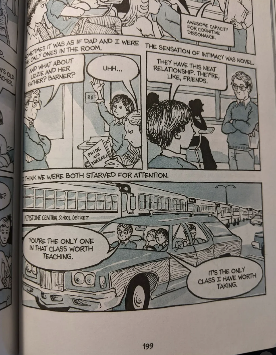
That car appears slightly earlier in the book, same angle and everything, but she adds a bank of school buses (overspending!) and wood paneling! I think she just likes to draw this stuff. But she always balances the detail work with bits of black and dialogue balloons with lots of air (gives white space to the page and atmosphere.) So maybe, if you draw the same thing twice, it's not as spendy as you would think. Maybe even budget-friendly! We've got some silhouettes and back-of-head moments and simple backgrounds to keep things simple in other areas of the page.
I hope this gives you ideas on approaching how to draw different moments and beats across the comics page! I hope you have some fun!
Jess Ruliffson is a lead instructor at SAW. Her webpage is https://jessruliffson.com .
Her book Invisible Wounds was nominiated for a 2023 Eisner Award and is available here: https://www.fantagraphics.com/products/invisible-wounds-interviews-with-american-vets
Thanks for reading!
Explore courses:
SAW Flow + Publish Membership Group
Our Six Month Graphic Novel Program
I WANT TO MAKE AND READ MORE COMICS!
Do you have a story inside you that’s just itching to come out, but want some guidance to help push it out?
Learn more about intensive comics learning with teachers at SAW by checking out SAW’s Year-Long Intensive Program and our Six-Month Graphic Novel Intensive.
Be sure to also check out our Online Courses, since some courses are offered year-round and are always enrolling!
Our Graphic Memoir Intensive runs year round and is always enrolling. It includes access to a vibrant working community, twice-monthly live online check-ins, weekly prompts, and access to SAW’s Monthly Pro Calls!
Our Comics Flow Group, or SAW FLOW MEMBERSHIP, is also year-round and always enrolling and is SAW's MOST AFFORDABLE course option with access to Monthly Pro-Calls!
And, of course, come see what we’re all up to on SAW's Mighty Network anytime!