
The Process, Justine's Odysseus Pages (part 2)

 The post originally appeared on my site: barefootjustine.com
2 of 6: In these 6 entries I am going to walk you step by step through the process I went through to create 6 of the 17 pages I pencilled and inked for the upcoming "The Odyssey Of Sergeant Jack Brennan" graphic novel. This is a DARPA funded project intended to assist veterans with PTSD. The power of myth lies in its metaphorical applications, and this project has used that to great effect and I am proud to have been a part of it. So… let's go...
The post originally appeared on my site: barefootjustine.com
2 of 6: In these 6 entries I am going to walk you step by step through the process I went through to create 6 of the 17 pages I pencilled and inked for the upcoming "The Odyssey Of Sergeant Jack Brennan" graphic novel. This is a DARPA funded project intended to assist veterans with PTSD. The power of myth lies in its metaphorical applications, and this project has used that to great effect and I am proud to have been a part of it. So… let's go...
Let's take up with page 6.
Methinks it might help to set this up a little. This page concerns the scene in which Aeolus offers the bag that controls the winds (through the power of Zeus) to Odysseus, and in this scene Aeolus is explaining and demonstrating the power of the bag. Essentially that was what I had to illustrate, and this is how I went about it.
At some point, while watching "Jason and the Argonauts," I was struck with how much a character in the movie would be a great Aeolus, so I did this quick gesture drawing of him as the movie was playing… not too inspiring, but it was enough for me to get an impression of the physical traits that struck me. Oddly, in the end, for some reason my Aeolus ended up looking nothing like this guy, and ended up looking like my dear friend Joseph Blue Sky--just like every other bearded man I've ever drawn.

Funny, but looking at the indistinct and nondescript thumbnails below, it doesn't seem as though I really had any idea what this page was going to be about, which is especially odd considering that it turned out to be a favorite of mine (which is why I chose it for inclusion here). My thinking was probably that since I had to turn in readable layouts for the whole story that the details of these preliminary thumbnails weren't all that important as the real thinking would come in the layouts, but even at that, I needed something to go on before ever getting to the layouts. There's very little to go on in this sketch, but the energy and motion of the central panel is already in evidence. And speaking of that central panel, this page and a few of the others are triptychs, meaning that they contain 3 upright panels (at least that's how I define triptychs in reference to my comics work).
More on triptychs below.

 To the left you can see a traditional religious triptych. Triptychs were common devices in Medieval art. Originally triptychs were altar pieces that were hinged and would fold in over the central panel. I'm not sure why, but triptychs have had a huge influence over my layouts. People sometimes ask me, "Why the long vertical panels?" Well… at least now you can all see where the influence came from. The more an artist knows, the deeper their bag of tricks, which is why I advocate so strongly for a classical approach to drawing when I teach, and for a greater understanding of art outside of comics. Some artists become very limited by their lazy decisions and undemanding ambitions. Now that I think about it, I don't believe I mentioned it in my earlier post about page 1, but it was also set up as a triptych.
Even knowing that I was going to have to do the complete layouts, I felt I needed to do more to resolve this page before proceeding. The problem is, as I stated before, of these two pages of thumbnails I'm not entirely sure which came first, but I am fairly certain the sketch below came next. I grabbed pens for these sketches as I sometimes find that ballpoint pens can be very freeing as the tension (even temptation) of knowing I will be able to erase them has been removed. I simply have to draw and trust myself with a pen.

On the back of the page of roughs above I worked out the central panel (seen below), which was the one that I knew had to be powerful, the one that, in a sense, the entire page hinged upon. I had a real strong feeling about how this panel should "feel" when it was viewed, which I often do, but I often don't know visually what that means until I start moving my pencil around. Unlike a lot of artists, I hardly ever see anything in my head, but I often feel something nebulous, like a ghost, that I have to bring into being through meditating on the act of sketching. I think you can see that by this point, I had finally worked out what the final panel was going to be all about.

We just found this early alternate original layout for this page, see below, and for comparison I have also included the second go at the layout (the one I turned in) below that. The biggest difference between them being that the two bottom panels on the left column were different, but there are also numerous other differences to hand positions and even the bottom right panel. More importantly, I felt the two little panels on the bottom left of the first layout were silly-looking in context, and I think I was right in seeing that the larger single panel had greater impact. Additionally, making them one panel gave them a stronger presence, which helped with an issue Tom Hart was to bring up later anyway… we'll get to that in a moment.

A big worry I had was that since I was sending in layouts for approval that I would be locked into the approved layouts, but I soon gave up on that fear realizing that working in that fashion (i.e. providing complete layouts of every page from the start) was limiting, and this would simply have to be accepted by all parties concerned--and besides, they would have another chance to look at the pencils before the pages were finished. I need time to let pages develop as I work on the pages before them. I did in the end vary from the layouts from time to time as many of my layouts were rushed and created in a flurry of tense exhaustion. Once refreshed I was able to come up with better ideas and include them in the final pencils. Compare the layouts directly below against the final pencils.
Upon seeing the final layout (see below), Tom Hart had complained that the eye tended to go straight from panel 1 (top left) to the central panel (panel 3), totally overlooking panel 2 (bottom left). He felt I needed to redraw, redesign and rethink my whole layout for the page. I both strongly agreed and strongly disagreed. Yes, the eye was being misguided in the original composition, but I was not willing to let go of the triptych, nor the strong central panel, so I thought back on something I had learned from Jim Steranko one evening while he was giving me a lengthy and insightful 90 minute portfolio review in the studio of Dan Adkins. Funny, now, how obvious it seems, but often as artists what can seem obvious to a mature artist can elude young artists for years until a Master like Jim steps in to set us straight. Jim had complained about a few of my panels (years ago) that the way my characters were pointing were often drawing my readers out of my pages, creating a random and chaotic experience that misled the eye. I realized that if the characters in the first panel were oriented towards the central panel, then the second (lower) panel was going to be overlooked in the hierarchy, so in the final pencils I turned my characters backs to the central panel and simultaneously created a motion towards the lower panel. When you get to the final pencil, notice that even the direction of their eyes draws the reader to the lower left panel, not so in the layout directly below.

As you can see in the pencils below the characters in the top panel are finally reoriented according to what I had learned from Steranko, thereby addressing Tom's concerns. Also, in order to keep the reader on the page, I didn't just turn Aeolus' back towards the central panel, and I didn't just have the movement in the panel (and the movement of their eyes) draw the eye downward, I also turned Odysseus in towards Aeolus, keeping us on the page, in that panel, and gently guiding the viewer to look downward.
Another thing that starts to happen in the pencils is that I begin seeing them inked. I have never been confident about my pencils, not in the least. Frankly, I really have no idea how to draw in pencil, not a complete drawing anyhow. I guess at heart I'm an inker. I LOVE the feel of the brush in my hand. When I see these, especially the central panel, I can see the brush lines already! The lower right panel I knew I would be inking with a toothpick (yes, I buy toothpicks and dip them in ink, then draw with those for effect sometimes), so I used my pencil in that fashion, often drawing gestural strokes with the side of the pencil. It's funny, but you'll notice a lot of hands on this page (and throughout my pages) and that is because I find hands easy and fun to draw--which I know is super odd as most people find them painfully challenging. I learned to draw hands by studying Alphonse Mucha's excellent and expressive hands, and before that by studying Bridgman's anatomy books. As you may realize, as in depth as these entries are about the process, what you are not seeing here are the years of hardwork that went into getting me to this point as an artist. At one point, early in my development, I traced and redrew every single image in my Bridgman's anatomy books.
Also note the difference in panel 4 (top right) in the pencils below. I realized after doing the layouts that we had all the power of Zeus billowing out of the bag… then suddenly Aeolus is drawing the bag tight. The storytelling was too abrupt, frankly, not terribly well thought-out, so I chose instead to show a panel of the wind being drawn back into the bag, which worked well with panel 2 (bottom left) in which the wind is just starting to rise up out of the bag. Note also that in the bottom left panel Aeolus is drawing the wind up with upturned hands, skip over to the top right panel and he is working the wind back into the bag with his hands and fingers now turned downward in the opposite direction. These are the little physical storytelling details that register withe a viewer even if they aren't consciously aware of them. And yes, those opposing hand positions were wholly intentional. They create anticipation and closure around the central action. Also, I essentially compressed panels 4 and 5 (layout above) into panel 5 (pencils below), realizing that the act of drawing the drawstrings closed and the image of Odysseus reaching for the bag could all be part of the same action.
Believe it or not I actually did some research to find classic sculptures of Zeus in order to come up with the "Zeus in the wind" image of the central panel. I'm with R. Crumb on this one… you can't make that shit up. When I look for an image like that I will often forego my instinct to draw influence from the one that grabs me, or the "coolest" image to instead opt for the one that is most iconic, or most readily recognizable. Artists often should decide on readability and appropriateness of an image from a storytelling perspective over a cooler image. The storytelling and clarity comes first, the dazzle of an image comes second.

And the inks below show that I essentially knew where I was going right from the pencils. When I pick up a brush (wood, metal and hair) and dip it in ink (wet and dark), then mark the paper (wood pulp), I feel viscerally and spiritually connected to every artist who ever picked up a brush. Not so when I pick up a micron, or God-forbid, a "brush pen." I see all those things as toys, mere kids stuff! I don't waste my time with such toys. I think in the final panel you can definitely see how the toothpick added a distinctive quality to the inks and the image.
Unfortunately I dread seeing this image in print as I know now that colorists are allowed, carte blanche, to run rampant over the work of some modern comics. An overly eager colorist can destroy anything I've drawn with the push of a computer key by increasing contrast or blowing out the black and converting the lines to color lines. This can utterly ruin dry brush lines. This is something that breaks my heart. Proud as I am to have been involved in this project, I don't think I will ever have the heart to look at the printed book when it comes out. Compare the printed book (after its release in 2015) to this image, look closely, see if the lines and image have broken down and degraded, see if the colorist has gotten cutesy and turned my beautiful clean crisp black lines to color lines. I imagine a lot of the subtlety will be lost, a lot of the strokes will be blown out, and many little areas will have filled in and gone gummy. I hope none of this happens, but I can only assume that between the colorist and the printing… some very unfortunate things may well occur. For me, the work I do is all about lines, line quality and the dominance of line… sadly, that no longer seems to matter in comics, not as much as it once did. I resent that my art will become a playground for some kid with a computer. Sadly, I have had to accept that this is simply the way things are. I don't have to like or agree with it, but I do have to accept it, especially if I want to keep working--and I need to keep working. This battle… I have lost, end of story. That said, those of us who believe in the beauty of line, or in the integrity of the work they create, and that someone else should not be allowed to play with, pervert, or manipulate their work, should at the very least be encouraged to speak up and make their case… so I did that here… it's all I have.
Again, the image below is larger and at a higher resolution than the sketches above, so you can click on it and zoom in a bit to get a closer look. This may be your only opportunity to see the images I have drawn the way they were intended to be seen.
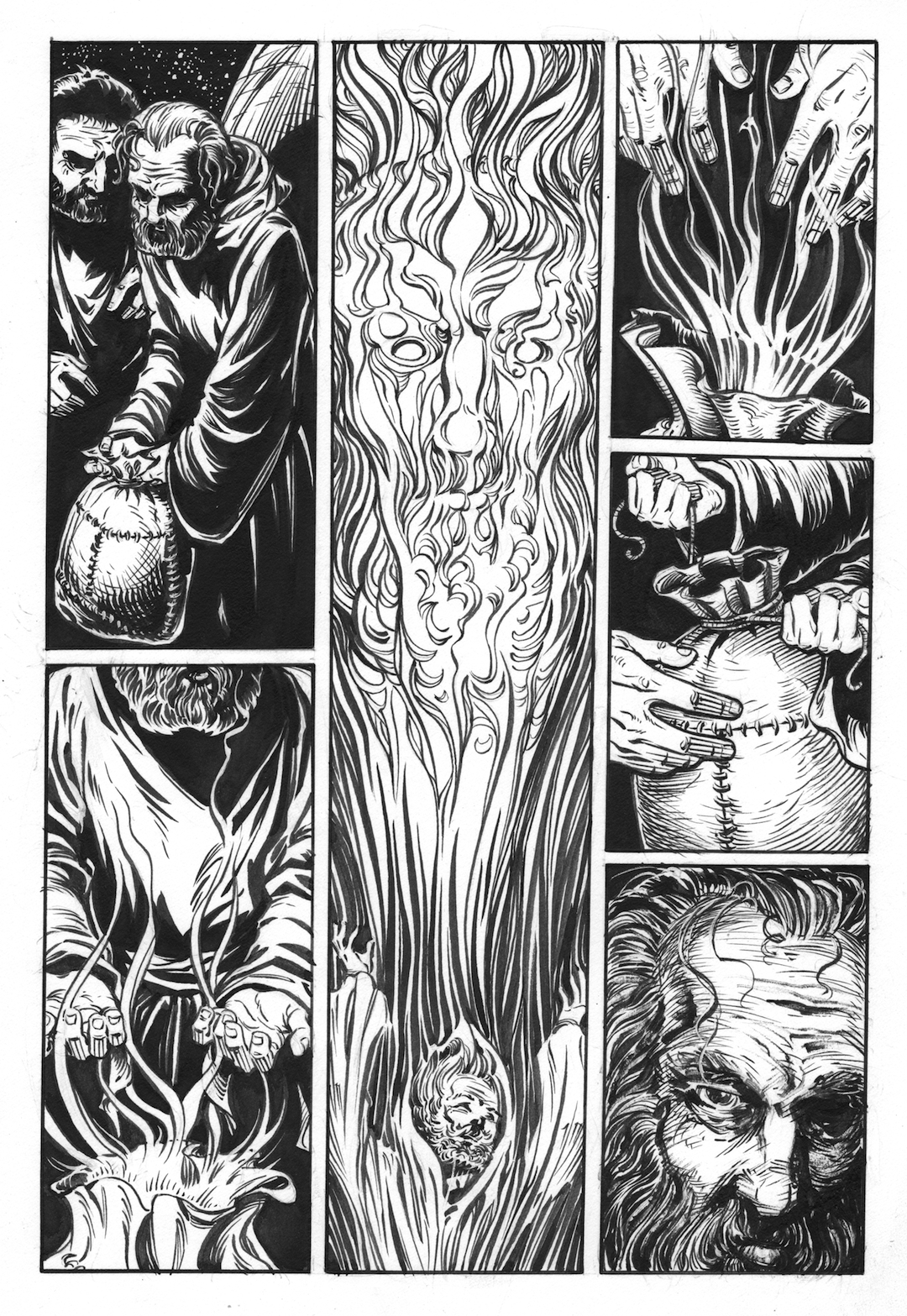
In the final panel I was highly influenced by the work of Joseph Clement Coll. Below the final inks I have included a very large detail of the final panel. This, of course, is the panel I inked with a toothpick. There is a very big difference between it and the brush-inked panels. I should also mention that I did go in and work a bit of it over with a brush, and even some white gouache.

Four more pages to come, so keep checking in. Next week I will be on to page 9.
To see the prior post about page 1, click here if not included below: http://barefootjustine.com/2014/09/02/justines-odysseus-page-1-an-in-depth-look-at-the-process/